Image by https://x.com/i/grok
The Evolution of Data Visualization: Trends to Watch in 2025
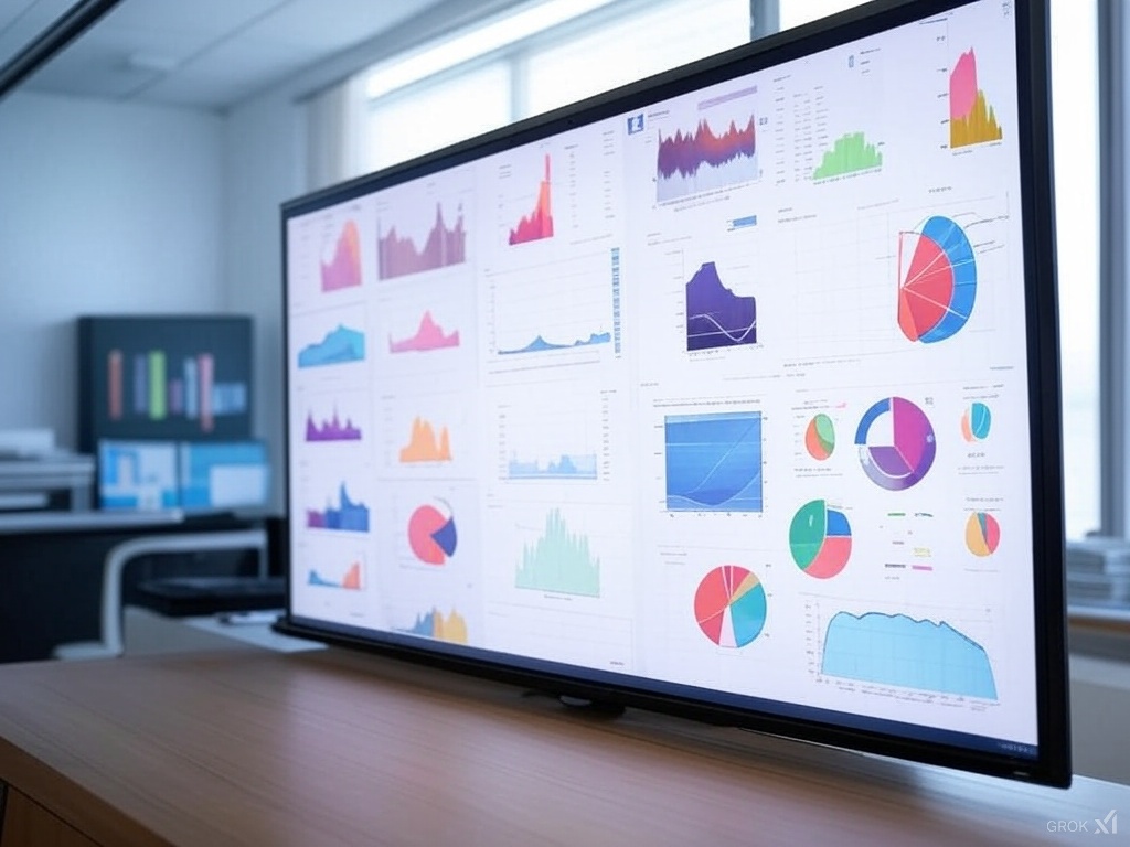
Data visualization has come a long way from simple charts and graphs to sophisticated, interactive displays that offer deep insights into complex data sets. As we move further into 2025, several trends are shaping the future of data visualization, making it more accessible, intuitive, and impactful.
1. Interactive and Immersive Experiences
The demand for interactive visualizations is growing as users seek to engage with data more dynamically. Tools that allow users to manipulate data in real-time and explore different scenarios are becoming increasingly popular. Virtual reality (VR) and augmented reality (AR) are also making their way into the data visualization space, offering immersive experiences that bring data to life.
2. AI-Driven Insights
Artificial intelligence is transforming data visualization by automating the generation of insights. AI algorithms can analyze vast amounts of data and highlight patterns or anomalies that might be missed by human analysts. This not only speeds up the decision-making process but also enhances the accuracy of insights.
3. Personalized Dashboards
Personalization is key in 2025, with dashboards tailored to individual user needs and preferences. These personalized dashboards provide users with the most relevant data, helping them focus on what matters most to their specific roles or interests.
4. Data Storytelling
Effective data storytelling combines data with narrative to convey insights in a compelling way. This trend emphasizes the importance of context and narrative in data visualization, making it easier for audiences to understand and act on the information presented.
5. Sustainability and Ethics
As data visualization becomes more prevalent, there is a growing emphasis on ethical considerations and sustainability. This includes ensuring data privacy, avoiding bias in visualizations, and using resources efficiently.
Conclusion
The evolution of data visualization in 2025 is characterized by increased interactivity, AI-driven insights, personalization, storytelling, and a focus on ethics. These trends are not only making data visualization more powerful but also more accessible to a wider audience. As technology continues to advance, we can expect even more exciting developments in this field.
Transform Your Data into Powerful Visual Stories
Start creating professional-looking charts with ChartGG today! Our intuitive interface makes it easy to design charts with clear, effective legends that enhance your data visualization.
Related Articles
The Importance of Chart Legends
Explore why chart legends are crucial in data visualization, enhancing clarity, consistency, and accessibility.
Introducing ChartGG: The Next Generation Data Visualization Tool
Learn about ChartGG, a powerful and intuitive data visualization tool that helps you create beautiful charts with ease.
Mastering Chart Styling: Essential Principles for Effective Data Visualization
Learn the key principles of styling charts to create clear, impactful, and professional data visualizations that effectively communicate your insights.