Image by https://x.com/i/grok
The Importance of Chart Legends
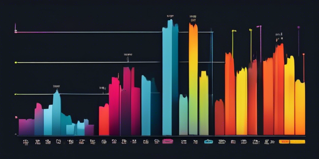
In the world of data visualization, clarity is paramount. Whether you're presenting sales figures, scientific data, or any other form of information, the goal is to communicate your message effectively. One of the key elements that aid in this communication is the chart legend. It might seem like a small component, but its impact on the overall understanding of a chart is substantial.
What is a Chart Legend?
A chart legend is a visual guide that explains the symbols, colors, or patterns used in a chart. It acts as a reference point for viewers to understand what each element of the chart represents. Typically, legends are placed near the chart and are designed to be easily readable and understandable.
Why Are Chart Legends Important?
-
Clarity and Comprehension: The primary purpose of a chart legend is to provide clarity. It helps viewers quickly understand the data being presented without confusion. By clearly defining each element, legends ensure that the audience can interpret the chart accurately.
-
Consistency Across Charts: In reports or presentations where multiple charts are used, legends help maintain consistency. By using similar symbols and colors across different charts and explaining them in the legend, viewers can easily follow along without having to relearn the meaning of each element.
-
Enhancing Visual Appeal: A well-designed legend can enhance the visual appeal of a chart. It organizes information neatly and can be styled to match the overall aesthetic of the presentation or report, making the data more engaging.
-
Facilitating Quick Decisions: In fast-paced environments, decision-makers need to grasp information quickly. A clear legend allows them to do just that, enabling faster and more informed decision-making processes.
-
Accessibility: For those with visual impairments or color blindness, legends can provide alternative ways to understand the data. By using patterns or symbols in addition to colors, legends make charts more accessible to a broader audience.
Real-World Examples of Effective Chart Legends
- Business Reports: In quarterly business reports, legends help stakeholders quickly discern between different data sets, such as revenue streams or departmental performance.
- Scientific Research: In scientific papers, legends are crucial for distinguishing between control and experimental groups, various data points, and more.
- Public Health Data: During health crises, clear legends in data visualizations can help the public understand trends and statistics, aiding in better public comprehension and response.
Best Practices for Creating Effective Chart Legends
- Keep it Simple: Avoid cluttering the legend with too much information. Stick to essential details that aid in understanding the chart.
- Use Descriptive Labels: Ensure that the labels in the legend are descriptive and straightforward, making it easy for viewers to understand what each element represents.
- Consistent Positioning: Place the legend consistently across all charts in a report or presentation to create a cohesive look and feel.
- Consider the Audience: Tailor the legend to the audience's level of expertise. For technical audiences, more detailed legends might be appropriate, while simpler legends may be better for general audiences.
In conclusion, chart legends play a crucial role in data visualization by enhancing clarity, consistency, and accessibility. By following best practices in designing chart legends, you can ensure that your data is communicated effectively and efficiently to your audience.
Ready to Create Beautiful Charts with Clear Legends?
Start creating professional-looking charts with ChartGG today! Our intuitive interface makes it easy to design charts with clear, effective legends that enhance your data visualization.
Related Articles
The Evolution of Data Visualization: Trends to Watch in 2025
Explore the latest trends shaping the future of data visualization in 2025, from interactive experiences to AI-driven insights and ethical considerations.
Introducing ChartGG: The Next Generation Data Visualization Tool
Learn about ChartGG, a powerful and intuitive data visualization tool that helps you create beautiful charts with ease.
Mastering Chart Styling: Essential Principles for Effective Data Visualization
Learn the key principles of styling charts to create clear, impactful, and professional data visualizations that effectively communicate your insights.