Understanding Chart Legends: A Complete Guide
Chart legends are fundamental components of data visualization that serve as a key to interpreting the information presented in your charts. In this comprehensive guide, we'll explore everything you need to know about chart legends and how to use them effectively.
What is a Chart Legend?
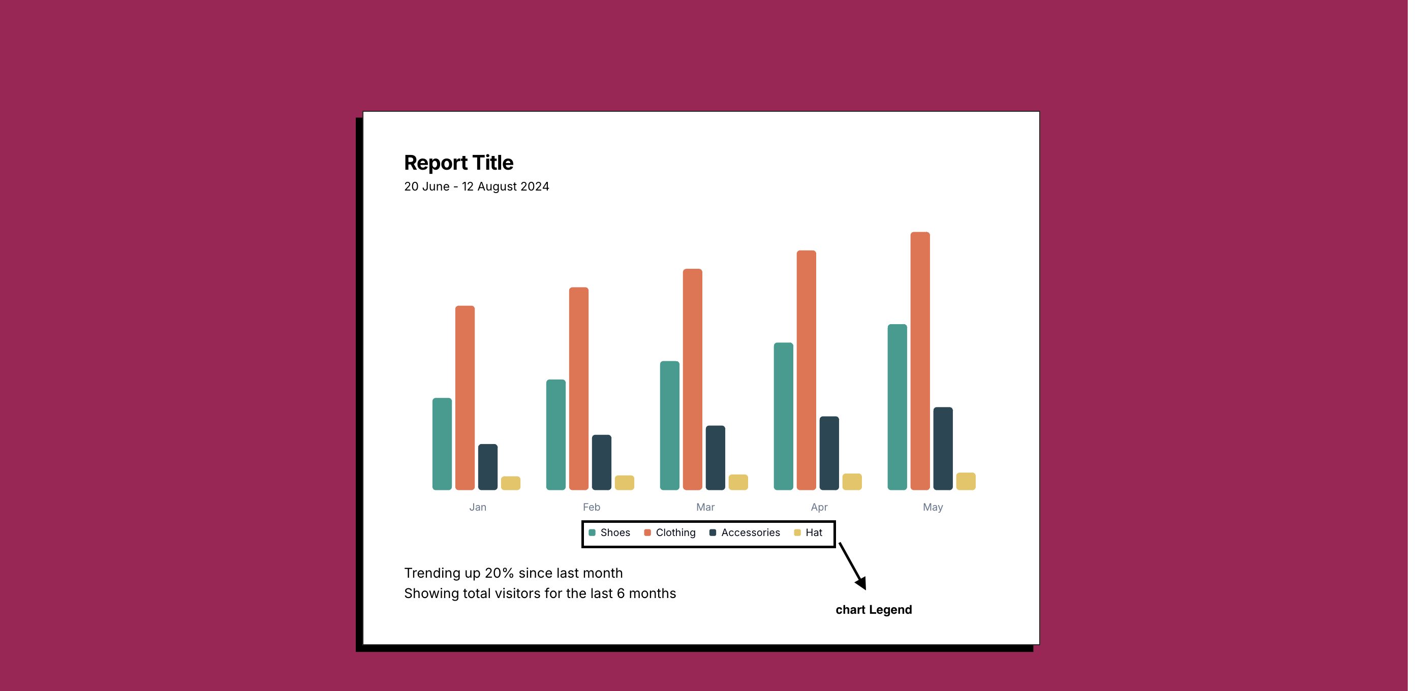
A chart legend, also known as a key, is a critical element in data visualization that helps readers understand the meaning of different visual elements in your chart. It acts as a decoder ring for your visualization, explaining what each color, symbol, or pattern represents.
Core Components of Chart Legends
-
Symbol/Color Indicators
- Visual representations of data series
- Color swatches or pattern samples
- Shape or line style indicators
-
Labels
- Data series names
- Category descriptions
- Value ranges (for gradient legends)
-
Optional Elements
- Scale information
- Units of measurement
- Additional context
Why Are Chart Legends Important?
1. Enhanced Data Interpretation
- Provides immediate context for visual elements
- Reduces cognitive load on viewers
- Prevents misinterpretation of data
2. Accessibility
- Makes charts understandable for colorblind users
- Provides text alternatives for visual elements
- Supports screen reader compatibility
3. Professional Presentation
- Adds credibility to your visualizations
- Creates a more polished look
- Maintains consistency across multiple charts
Best Practices for Chart Legends
1. Placement
- Position legends where they don't obstruct data
- Common locations: right side or bottom of chart
- Consider user reading patterns (left-to-right, top-to-bottom)
2. Design and Formatting
- Use consistent styling
- Maintain adequate spacing
- Keep text legible and concise
- Match legend order with data presentation
3. Content Organization
- Group related items together
- Use hierarchical structure when needed
- Limit the number of items (aim for 5-7 maximum)
4. Interactive Features
- Implement hover effects
- Add click-to-hide functionality
- Include search/filter options for complex legends
Common Mistakes to Avoid
-
Overcrowding
- Too many legend items
- Insufficient spacing
- Overlapping elements
-
Poor Visibility
- Low contrast colors
- Too small text
- Unclear symbols
-
Inconsistent Ordering
- Mismatched data and legend order
- Random arrangement
- Lack of logical grouping
Advanced Legend Techniques
1. Dynamic Legends
- Update automatically with data changes
- Show/hide functionality
- Interactive filtering
2. Responsive Design
- Adapt to different screen sizes
- Maintain readability on mobile devices
- Alternative layouts for different viewports
3. Custom Styling
- Brand color integration
- Custom symbols and icons
- Unique layout patterns
When to Skip the Legend
Sometimes, legends aren't necessary:
- Single data series charts
- Direct labeling is more effective
- Very simple visualizations
- Limited space with clear context
Conclusion
Chart legends are more than just decorative elements – they're essential tools for effective data communication. By following these guidelines and best practices, you can create legends that enhance your visualizations and make your data more accessible and understandable for all users.
Ready to Create Charts with Perfect Legends?
Start creating professional charts with clear, intuitive legends today. Make your data visualizations more accessible and impactful.
Related Articles
The Evolution of Data Visualization: Trends to Watch in 2025
Explore the latest trends shaping the future of data visualization in 2025, from interactive experiences to AI-driven insights and ethical considerations.
The Importance of Chart Legends
Explore why chart legends are crucial in data visualization, enhancing clarity, consistency, and accessibility.
Introducing ChartGG: The Next Generation Data Visualization Tool
Learn about ChartGG, a powerful and intuitive data visualization tool that helps you create beautiful charts with ease.