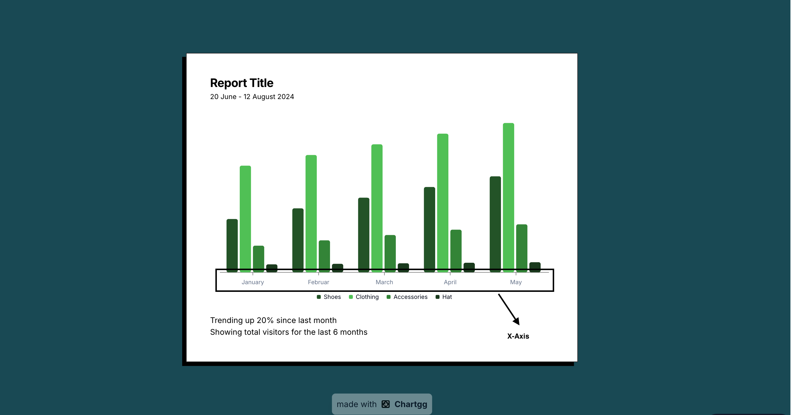
Understanding X-Axis on Charts: A Comprehensive Guide
The x-axis is a fundamental component of any chart or graph, serving as the horizontal reference line that helps organize and interpret data. In this comprehensive guide, we'll explore what the x-axis is, its purpose, and how to use it effectively in your data visualizations.
What is the X-Axis?
The x-axis, also known as the horizontal axis, is the horizontal line in a chart that runs from left to right. It typically represents:
- Independent variables
- Time series data
- Categories or groups
- Continuous numerical values
The Role of X-Axis in Different Chart Types
Line Charts
In line charts, the x-axis often represents time progression, making it ideal for showing trends and patterns over time. For example, stock prices over months or temperature changes throughout a day.
Bar Charts
Bar charts use the x-axis to display different categories or groups. Each bar rises from the x-axis, making it easy to compare values across categories.
Scatter Plots
In scatter plots, the x-axis represents one of two variables being compared, helping to identify correlations and relationships between data points.
Best Practices for X-Axis Usage
-
Clear Labels: Always use clear, readable labels that accurately describe what the axis represents.
-
Appropriate Scale: Choose a scale that effectively shows your data without distortion.
-
Consistent Intervals: Maintain consistent spacing between values or categories.
-
Proper Orientation: Ensure labels are readable - consider angling them if they overlap.
Common X-Axis Properties
- Scale: Linear, logarithmic, or categorical
- Range: The span of values from minimum to maximum
- Tick marks: Visual indicators of value positions
- Grid lines: Optional lines that help read values accurately
When to Start the X-Axis at Zero
Unlike the y-axis, the x-axis doesn't always need to start at zero. The starting point depends on:
- The type of data being displayed
- The story you're trying to tell
- The nature of the comparison
Tips for Effective X-Axis Design
- Keep it Simple: Avoid cluttering with unnecessary labels or decorations
- Use Appropriate Units: Match units to your data context
- Consider Your Audience: Adjust technical detail based on who will read the chart
- Maintain Proportions: Ensure the axis length supports clear data visualization
Conclusion
The x-axis is more than just a line - it's a crucial element that guides data interpretation and enhances understanding. By following these guidelines, you can create more effective and professional charts that clearly communicate your data story.
Ready to Create Charts with Perfect X-Axis?
Start creating professional charts with clear, well-structured x-axes today. Make your data visualizations more accurate and easier to understand.
Related Articles
The Evolution of Data Visualization: Trends to Watch in 2025
Explore the latest trends shaping the future of data visualization in 2025, from interactive experiences to AI-driven insights and ethical considerations.
The Importance of Chart Legends
Explore why chart legends are crucial in data visualization, enhancing clarity, consistency, and accessibility.
Introducing ChartGG: The Next Generation Data Visualization Tool
Learn about ChartGG, a powerful and intuitive data visualization tool that helps you create beautiful charts with ease.