Understanding Y-Axis on Charts: A Comprehensive Guide
The y-axis is a crucial element in data visualization, serving as the vertical reference line that helps measure and compare values. In this comprehensive guide, we'll explore what the y-axis is, its significance, and how to utilize it effectively in your charts.
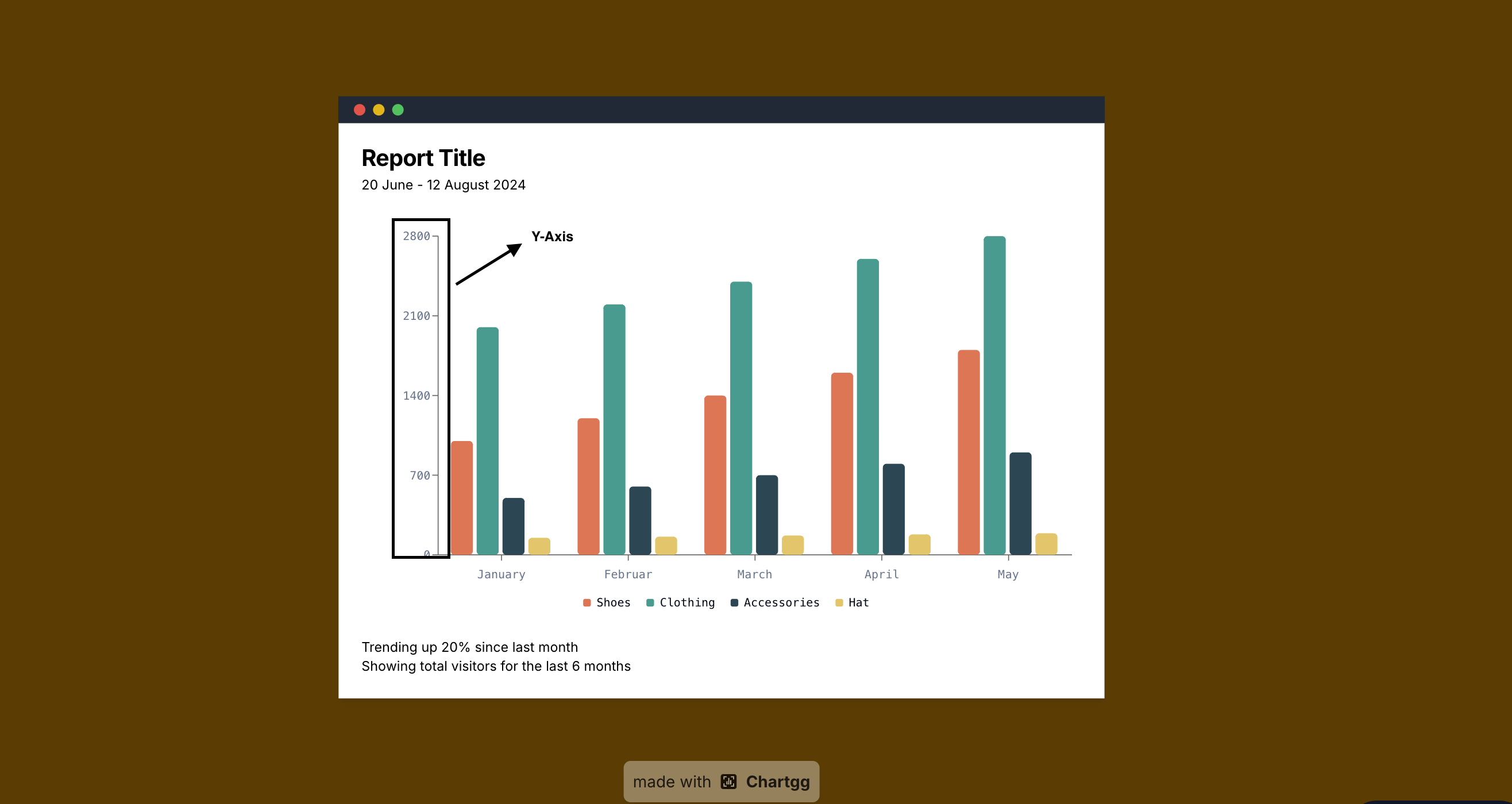
What is the Y-Axis?
The y-axis, also known as the vertical axis, is the vertical line in a chart that runs from bottom to top. It typically represents:
- Dependent variables
- Measured values
- Frequencies
- Percentages or proportions
The Role of Y-Axis in Different Chart Types
Line Charts
In line charts, the y-axis shows the magnitude of values, making it essential for displaying metrics like sales figures, temperature readings, or any quantitative measurements over time.
Bar Charts
Bar charts use the y-axis to show the height of each bar, representing quantities or values. This makes it easy to compare magnitudes across different categories.
Scatter Plots
In scatter plots, the y-axis represents one of two variables being compared, helping to visualize relationships and correlations between data points.
Best Practices for Y-Axis Usage
-
Zero Baseline: Start at zero when showing quantities or magnitudes to avoid misleading representations.
-
Appropriate Scale: Choose a scale that effectively displays your data range without distortion.
-
Clear Units: Always indicate the units of measurement clearly.
-
Consistent Intervals: Use regular intervals between values for easy reading.
Common Y-Axis Properties
- Scale: Linear, logarithmic, or percentage
- Range: The span from minimum to maximum values
- Tick marks: Regular markers indicating value positions
- Grid lines: Horizontal lines aiding in value reading
When to Break the Zero Rule
While starting at zero is generally recommended, there are exceptions:
- When showing small differences in large numbers
- For ratio scales
- When displaying changes rather than absolute values
Tips for Effective Y-Axis Design
- Avoid Axis Breaks: They can distort data perception
- Use Appropriate Decimals: Match precision to your data context
- Consider Scale Transformation: Use log scale for large value ranges
- Label Placement: Ensure labels are readable and don't overlap
Conclusion
The y-axis is fundamental to accurate data interpretation and comparison. By following these guidelines, you can create more effective and honest data visualizations that clearly communicate your message.
Ready to Create Charts with Perfect Y-Axis?
Start creating professional charts with clear, well-structured y-axes today. Make your data visualizations more accurate and easier to understand.
Related Articles
The Evolution of Data Visualization: Trends to Watch in 2025
Explore the latest trends shaping the future of data visualization in 2025, from interactive experiences to AI-driven insights and ethical considerations.
The Importance of Chart Legends
Explore why chart legends are crucial in data visualization, enhancing clarity, consistency, and accessibility.
Introducing ChartGG: The Next Generation Data Visualization Tool
Learn about ChartGG, a powerful and intuitive data visualization tool that helps you create beautiful charts with ease.